1 Comment
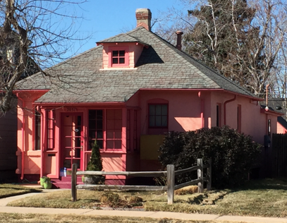
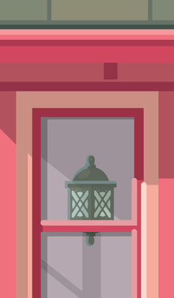
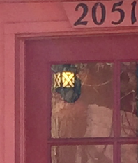
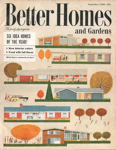
Last week I put my "Modern in Winter" print on my Etsy store and a newly created store on my website. The results have been great and I've been selling quite a number of the limited edition prints. This is a really fun - and rather new - venture for me. Most of the work I've done throughout my career as an Illustrator, has been commissioned and ultimately owned by the client. That's all great and I hope it continues that way for a LONG time. Selling a print, by comparison, is a whole new kind of fun! I actually get to put my name on it! Imagine that. I can count the number of times on one hand (maybe two) that I've had the luxury of claiming a piece of art in such a personalized way. In the week since Modern in Denver ran a link, telling readers about the availability of my poster, there has been a really nice response to the offering. The limited edition run of 100 prints is moving along nicely. I enjoyed tweaking the art from the cover of the magazine: enlarging the homes a bit, adding in one new home to the existing 6, changing the background blue to a vintage-y robins egg blue. I'm very happy with the results and it's been great to hear from buyers that they like the "new" look as well. Thanks to all you buyers of the print! Absolutely appreciate the support...and enjoy being part of your Mid-Century Modern world. 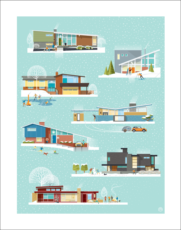 There are SO many great homes in Denver. Quite a few of my trips across town include a stop -or two- to gape and take photos of a home that commands my attention. Every once and while, a home will catch my eye because it's such an individual expression of the owner's taste or personality. On Monday I came across the "Little Pink House" (as I'm choosing to call it). What a gem! It screamed to me that it wanted it's portrait done. Who could resist? I have a passion for small homes - check out my Pinterest board "Small Space Living" and this home was a perfect combination of color, period style, and compactness. It took a second trip to the house to capture more details that didn't show up in the first photos I took. That often happens and I've learned that "You don't know, what you don't know, until you don't know it". Know what I mean? In this case it mostly had to do with the windows. From the photos I took, I couldn't tell if they were the same height on both sides of the porch...they seemed a bit different, but it wasn't clear (they are!)...so off I went, with Dexter in the back seat, to grab a few more pics (and a necessary afternoon coffee). While there, I found that I hadn't gotten a good shot of the random block pattern at the base of the home or that great little light on the front porch...once I did, I had to include those elements. For me, these are the details that make the portrait come alive. In particular, I liked how many different shades of pink had been used by the homeowner. It looks like they choose the colors based on their favorite ice cream and sherbet flavors! Whoever choose those lime green pots on the front steps knew exactly what they were doing. What a perfect color combination! I liked the combo so much that I used the lime green as the accent color for the title bar of the illustration. I'm including a picture of the actual home...just so you don't think I make this stuff up. Word has it that Barbie did the color consultation. Maybe on another trip down to Platt Park, I'll slide a printed copy of the illustration under their door -and hope it'll please them that someone thought their great little home was worth capturing in an illustration. 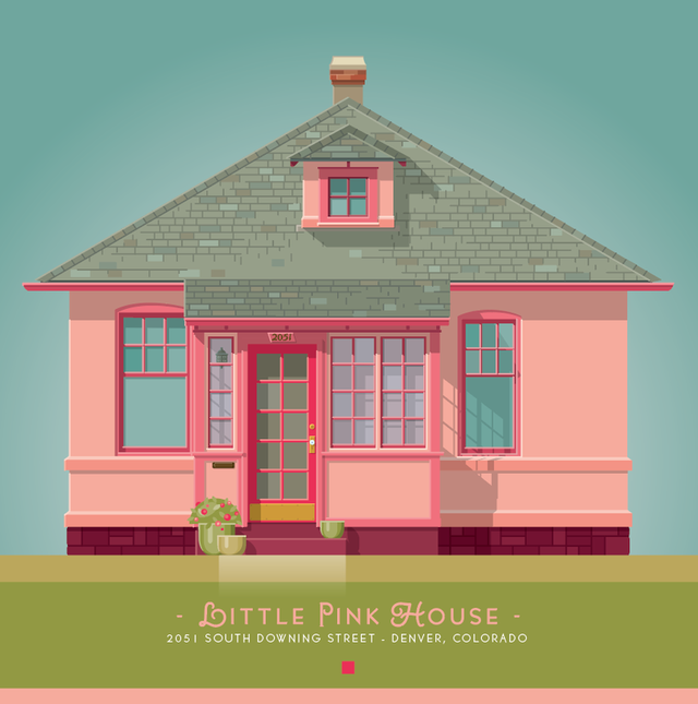
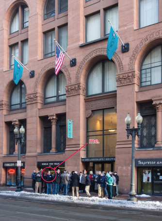
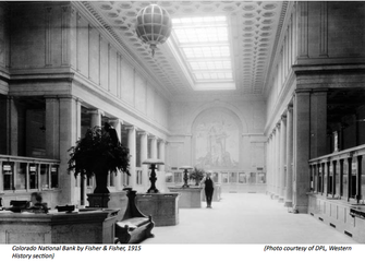
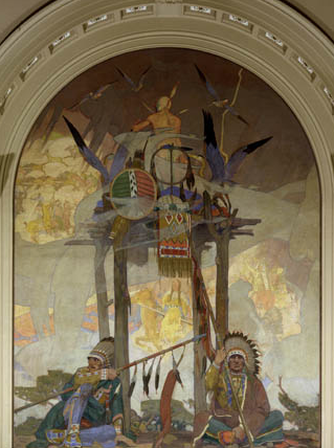
 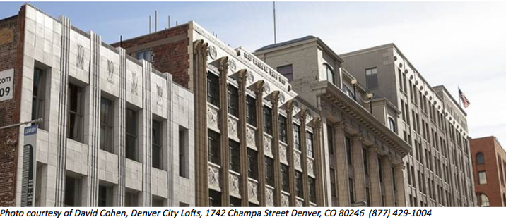 Over the last year, I've attended a number of tours given by the Institute of Classical Architecture and Art. First coffee, then off for a morning tour...two of my favorite things...perfect! I've gotten to see a number of buildings, venues and locations that have great architectural and historical importance to Denver. This city is so rich in history and still has quite a number of amazing structures still standing (although Denver Urban Renewal of the '80's decimated hundreds of significant structures). ICAA is a great organization that has provided me the opportunity to learn and see portions of the city that (as a newcomer) I'm not all that familiar with. This particular tour, given on Dec. 19th, was an exploration of the Chamber Lofts and several other downtown "jewels" nearby. The tour included the fantastic and elaborately ornamented Art Deco Buerger Brothers Beauty Supply building (1929), The Ideal Building (1907), The Colorado National Bank (1915) -including the beautiful murals by Allen Tupper True- and the Chamber of Commerce "Temple to Commerce" building (1910). A great tour, led and organized by Tom Matthews of ICAA, partnering with Historic Denver and Colorado Preservation.
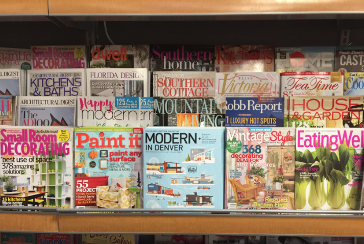
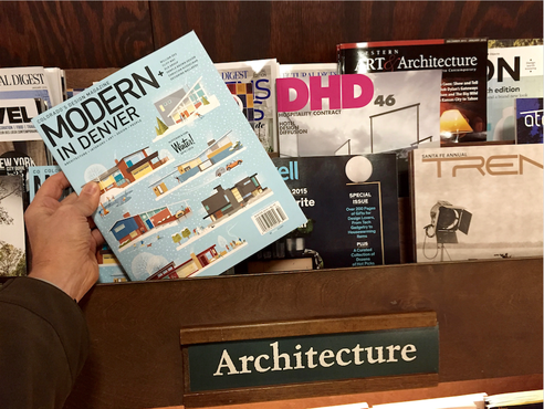
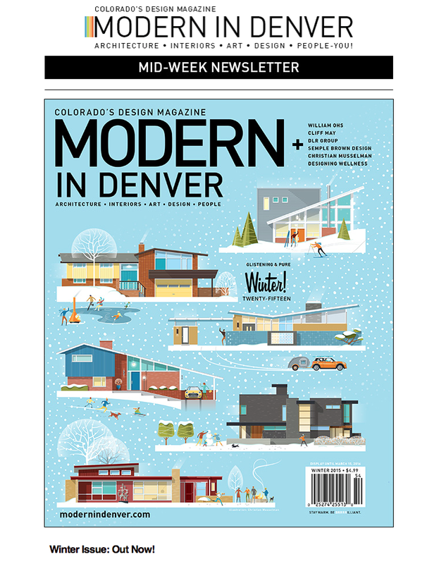
I just got my mid-week newsletter from Modern in Denver --letting readers know that the Winter Issue was out. December 15th marked the day that the magazine was being shipped to subscribers and newsstands. I haven't seen the issue in print yet, so I'm very excited to see how the cover and inside feature story look in person -and in the newsstand line-up. I was asked to work on this project about 6 weeks ago, and it has offered me the privilege of working with William Logan at Modern in Denver. I can't thank him enough for asking me to create the cover for the magazine. In addition, they also did an "Artist Profile" article on me and my custom home portrait work - which includes quite a number of my home portrait illustrations. What an incredible opportunity! The cover concept was inspired by a Better Homes and Gardens magazine cover from September 1958. A classic! Fall was changed to Winter. Cars and a couple of homes were updated to contemporary styles and tastes. Overall, the concept was updated to a more modern sensibility. The second home from the bottom (the dark gray home) is the featured home in the Winter issue. We even found a way to include a couple of employee dogs, a car, and family members. This project was a lot of fun to work on and I can't wait to see the end results of the collaboration. I'll post again soon -when I have the magazine in hand and can share a little more about creating the artwork and working with Modern in Denver.
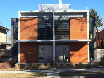
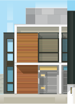
 Select the masthead below to see a list of the contents in the Winter Issue.  Over a month ago, I ask a friend (Diane) if she'd take a look at a few options for the image I'd be using for my Winter - Atomic Ranch magazine ad. She's a true MCM aficionado and I value (greatly!) her insight into what she feels "works"...especially for projects like this. Diane is active on the Friends of Atomic Ranch FaceBook site and I got the idea that it might be fun to have her post the 3 images and ask those readers for their opinions. I had decided that in creating an ad for the Winter edition it might be fun to show an ad that was more seasonal for the edition; moodier colors, maybe snow... Although I like the snow concept, I wasn't sure if it was right way to proceed for this publication. Diane posted the three concepts: one with snow filling the whole background. One with snow that fell above a "s" shape design, and another with no snow at all. I was a very fun, interesting and surprising experiment to show the 3 ideas to this highly motivated group and ask which version they liked. Using the seasonal snow background was clearly the way to go (I was hoping for this outcome). With only a few exceptions, the winner was split between A and C. It was really interesting to hear how people interpreted the snow. Some thought they were "stars", others thought the "swoosh" pattern was a hill - and, as you can image, everything in between. My final choice? It ended up being "C". I hope you'll think it was the right choice too! Atomic Ranch has shipped to subscribers in the past week+ and if not already, it will be on newsstands any day now. I hope you'll check it out. Thanks, Friends of Atomic Ranch! I appreciated your responses and interest in being part of this process. 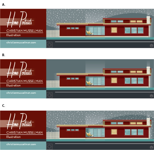 |
ABOUT CHRISTIANHi! I'm an Illustrator and designer, living and working in Denver. I have a life-long love affair with architecture and design. I have created this blog to share some thoughts and images that inspire me...and provide an update into what I've been up to lately. 
- tools of the trade.
Archives
January 2018
Categories |


 RSS Feed

|
|

©Christian Musselman - all rights reserved
These images may not be published, reproduced, or altered in any way without the express written permission of Christian Musselman
These images may not be published, reproduced, or altered in any way without the express written permission of Christian Musselman