|
Last week I put my "Modern in Winter" print on my Etsy store and a newly created store on my website. The results have been great and I've been selling quite a number of the limited edition prints. This is a really fun - and rather new - venture for me. Most of the work I've done throughout my career as an Illustrator, has been commissioned and ultimately owned by the client. That's all great and I hope it continues that way for a LONG time. Selling a print, by comparison, is a whole new kind of fun! I actually get to put my name on it! Imagine that. I can count the number of times on one hand (maybe two) that I've had the luxury of claiming a piece of art in such a personalized way. In the week since Modern in Denver ran a link, telling readers about the availability of my poster, there has been a really nice response to the offering. The limited edition run of 100 prints is moving along nicely. I enjoyed tweaking the art from the cover of the magazine: enlarging the homes a bit, adding in one new home to the existing 6, changing the background blue to a vintage-y robins egg blue. I'm very happy with the results and it's been great to hear from buyers that they like the "new" look as well. Thanks to all you buyers of the print! Absolutely appreciate the support...and enjoy being part of your Mid-Century Modern world. 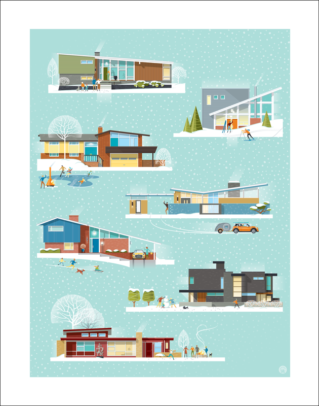
0 Comments
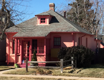
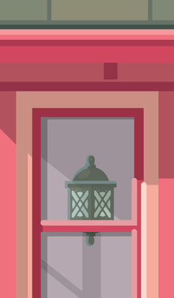
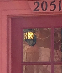
There are SO many great homes in Denver. Quite a few of my trips across town include a stop -or two- to gape and take photos of a home that commands my attention. Every once and while, a home will catch my eye because it's such an individual expression of the owner's taste or personality. On Monday I came across the "Little Pink House" (as I'm choosing to call it). What a gem! It screamed to me that it wanted it's portrait done. Who could resist? I have a passion for small homes - check out my Pinterest board "Small Space Living" and this home was a perfect combination of color, period style, and compactness. It took a second trip to the house to capture more details that didn't show up in the first photos I took. That often happens and I've learned that "You don't know, what you don't know, until you don't know it". Know what I mean? In this case it mostly had to do with the windows. From the photos I took, I couldn't tell if they were the same height on both sides of the porch...they seemed a bit different, but it wasn't clear (they are!)...so off I went, with Dexter in the back seat, to grab a few more pics (and a necessary afternoon coffee). While there, I found that I hadn't gotten a good shot of the random block pattern at the base of the home or that great little light on the front porch...once I did, I had to include those elements. For me, these are the details that make the portrait come alive. In particular, I liked how many different shades of pink had been used by the homeowner. It looks like they choose the colors based on their favorite ice cream and sherbet flavors! Whoever choose those lime green pots on the front steps knew exactly what they were doing. What a perfect color combination! I liked the combo so much that I used the lime green as the accent color for the title bar of the illustration. I'm including a picture of the actual home...just so you don't think I make this stuff up. Word has it that Barbie did the color consultation. Maybe on another trip down to Platt Park, I'll slide a printed copy of the illustration under their door -and hope it'll please them that someone thought their great little home was worth capturing in an illustration. 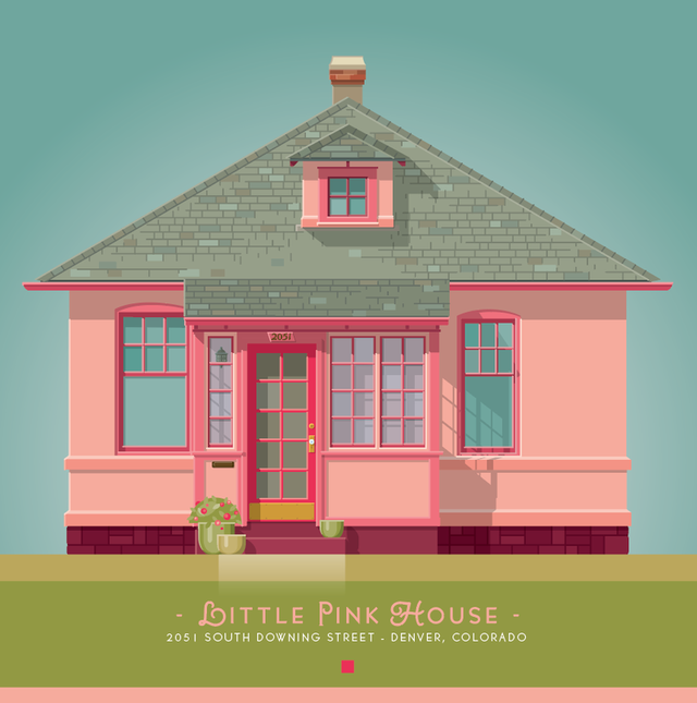
|
ABOUT CHRISTIANHi! I'm an Illustrator and designer, living and working in Denver. I have a life-long love affair with architecture and design. I have created this blog to share some thoughts and images that inspire me...and provide an update into what I've been up to lately. 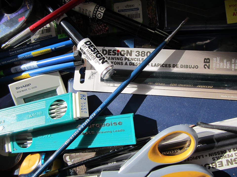
- tools of the trade.
Archives
January 2018
Categories |

 RSS Feed

|
|

©Christian Musselman - all rights reserved
These images may not be published, reproduced, or altered in any way without the express written permission of Christian Musselman
These images may not be published, reproduced, or altered in any way without the express written permission of Christian Musselman